
Does a customer already asked you to make a reponsive PowerApps application? So let me show you how to do it and the little tricks to know.
- Desactivate the Scale to fit parameter
- Containers screens
- Tricks and tips
- Forms issue
- Video : MWCP 2022 conference (video in French)
1. Desactivate the Scale to fit parameter
It is the first step. Without this parameter desactivated you won’t be able to have an extended screen.
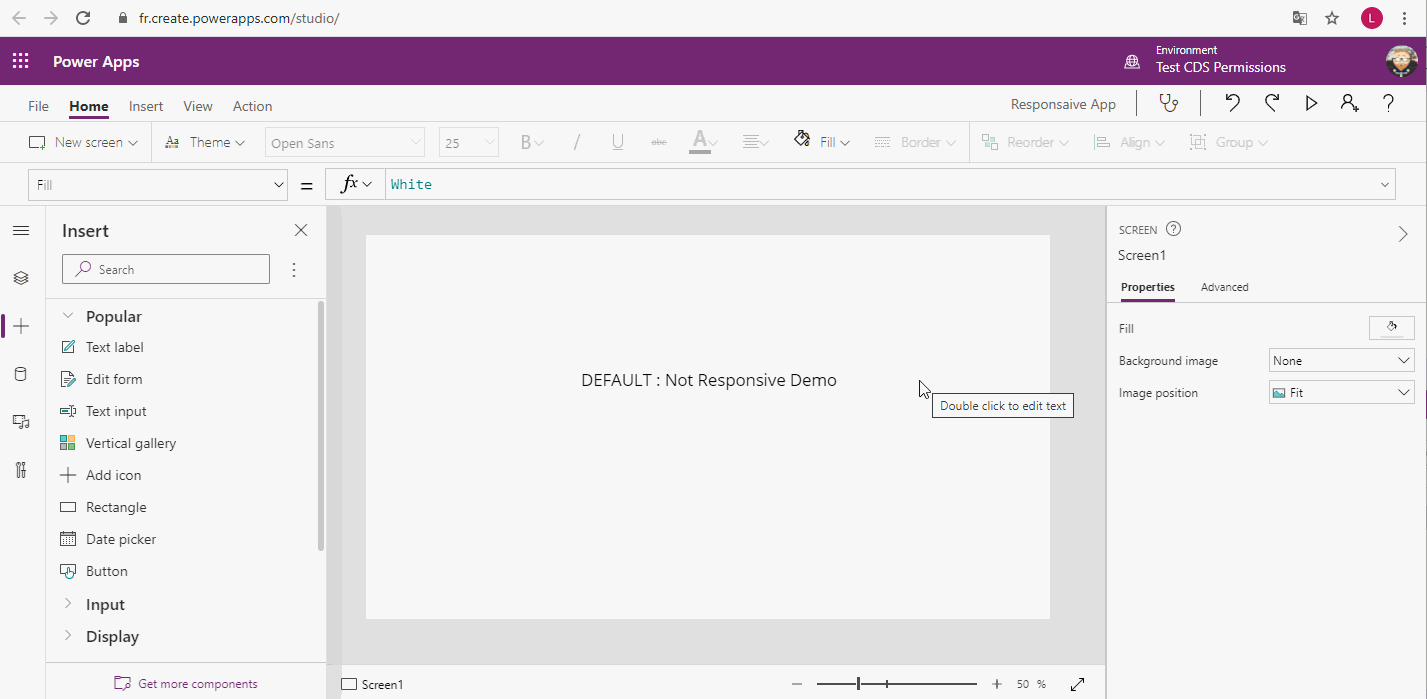
By default, my application is not responsive. If while editing I am clicking on play I will be able to see grey border (on top/bottom or left/right side depending of your resolution).
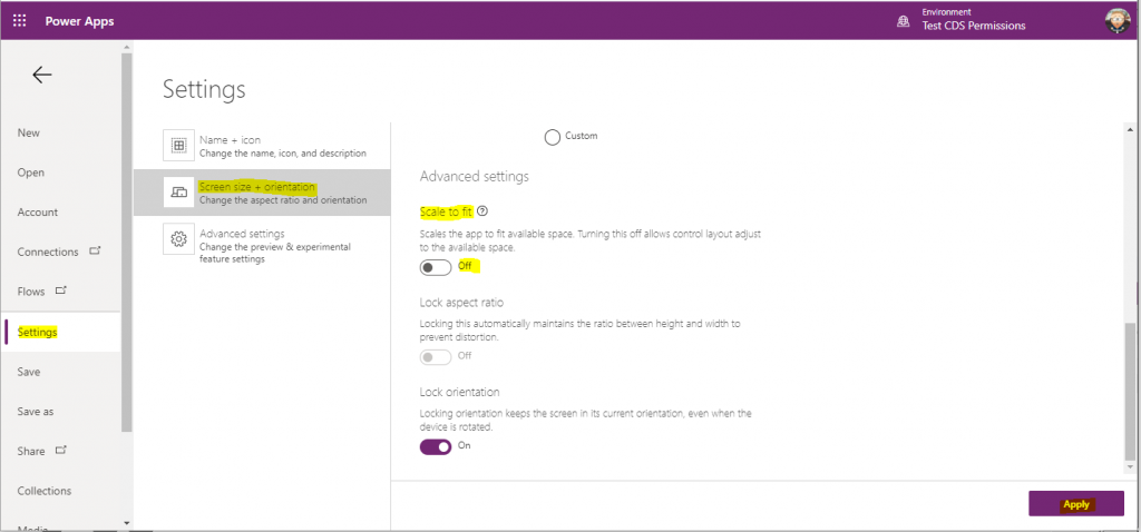
You need to desactivate the Scale to fit parameter. In File > Settings > Screen size + orientation > Scale to fit set to Off
Like the screenshot below:
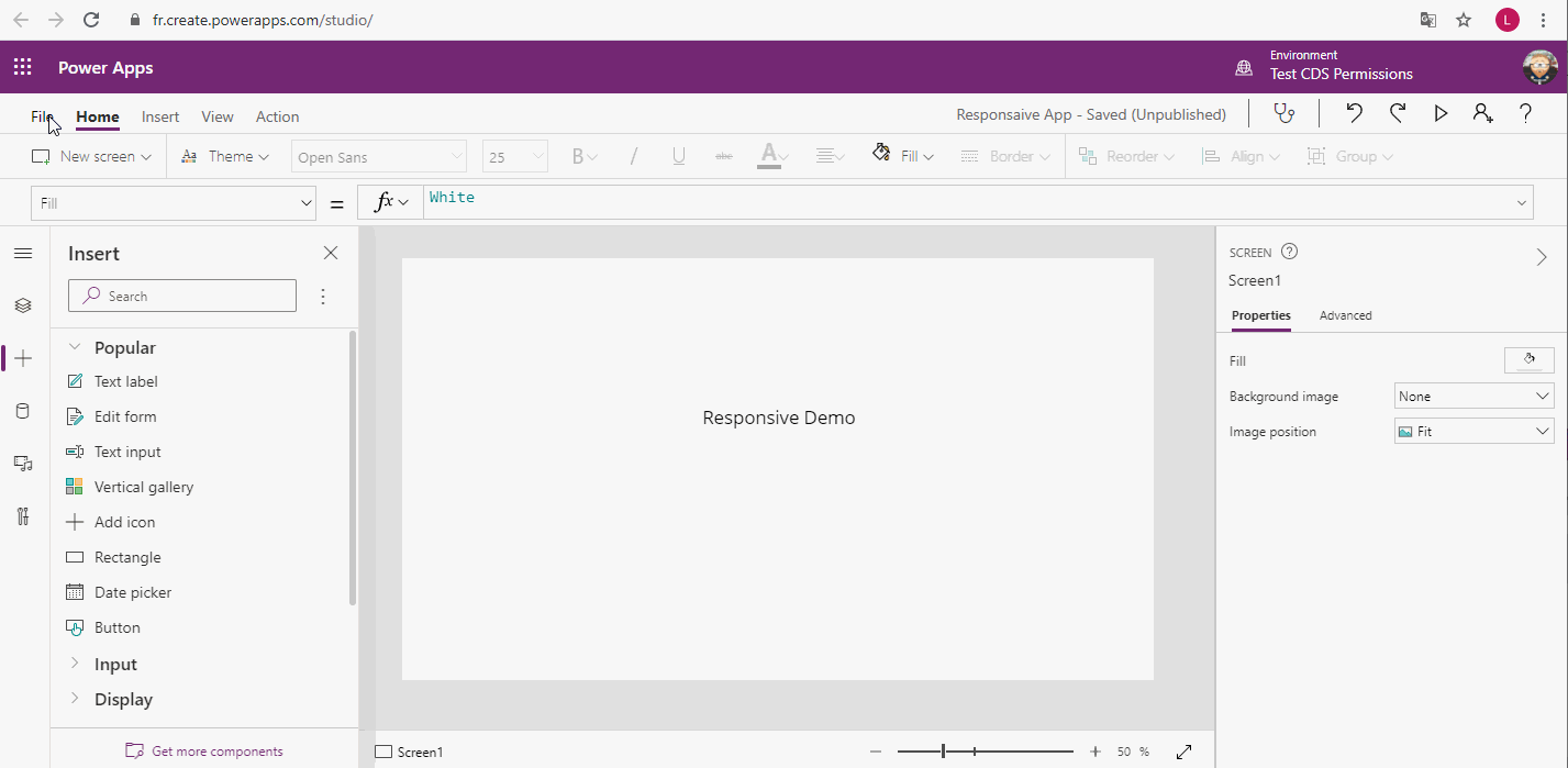
Now your screen is going to take all the available width and height. No grey border anymore.
Important: This works for the Canvas Application, about SharePoint form you can read my note at the end of the article.
2. Containers screens
2.1. Introduction
The containers screen are going to be very usefull while doing responsive app, because a container screen adapt itself to the screen.
But in a container, you don’t decide where the element is. Of course you can play with parameters, but each elements are going to be below each other or next to each other.
2.2. Available screens
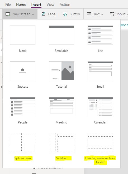
As I am writing this article (the 12th of February 2021) there are three containers screens.
- Split-screen
- Sidebar
- Header, main section, footer
If you want to change these containers screen, see below.
2.3. Make your own containers screens
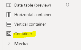
Sometimes, the proposed contianers screens are not enough. Well you can start from a blank page and add container. Or edit an existing screens container. Click on + > Layouts > Horizontal container or Vertical container.
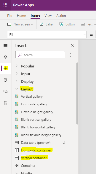
Very important to note:
- If you create your own container screen, have a closer look to the existing PowerApps containers screens. There are all in one container which have for width Parent.Width. It is really important to build your container screen the same way to keep your app responsive.
- Always select the container where you want to add another child container.
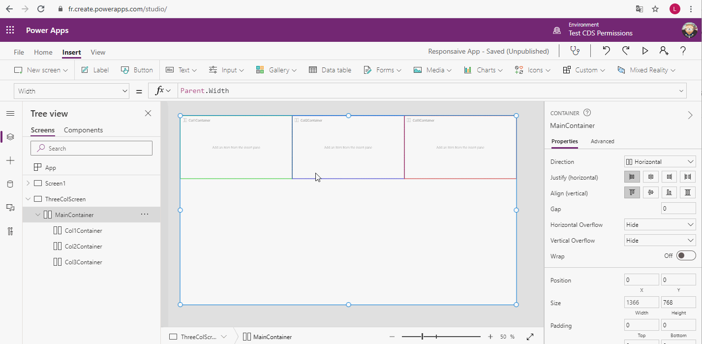
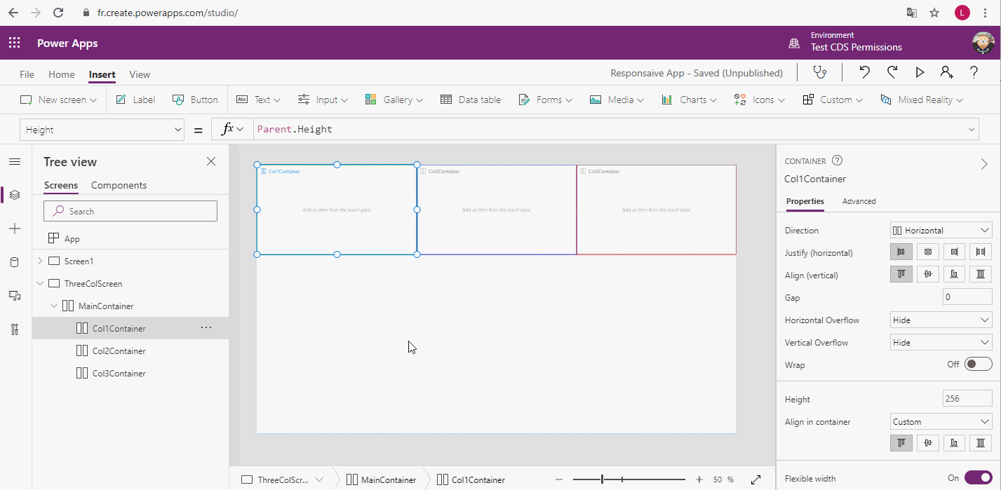
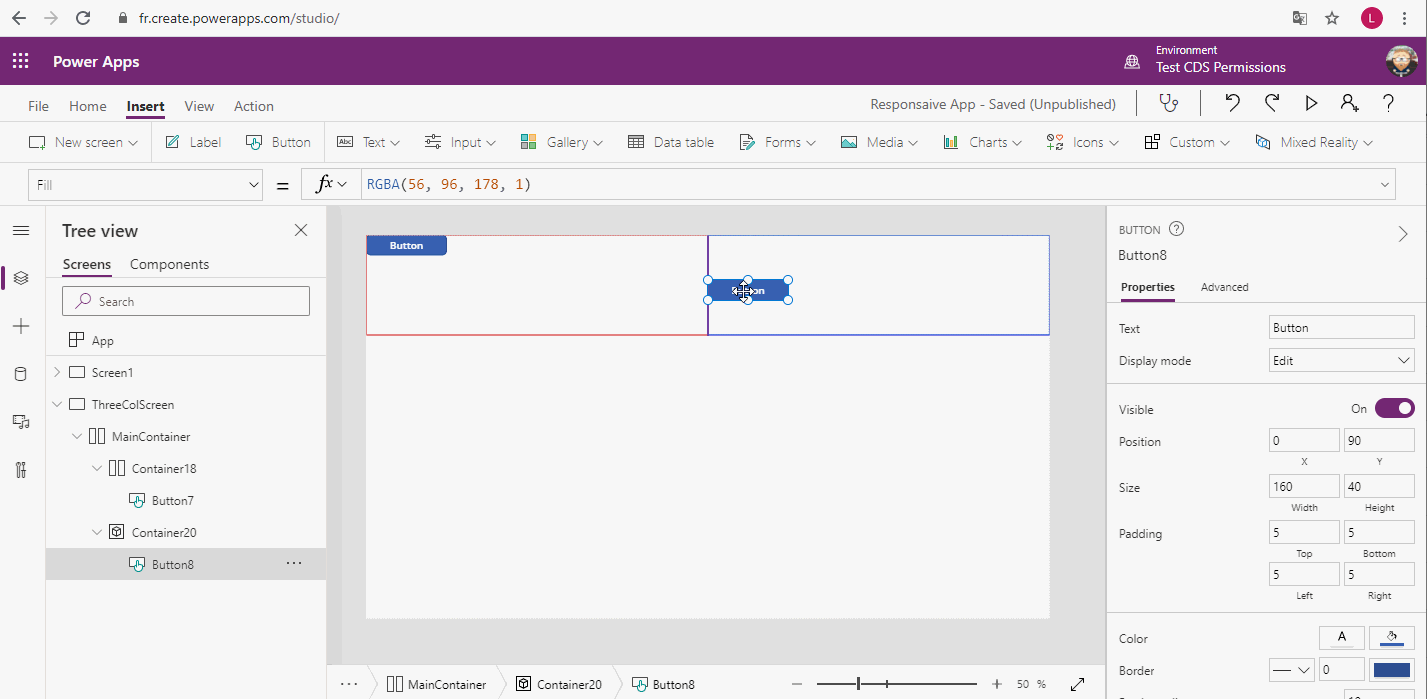
For example, let’s create a screen with three columns.
2.4. Containers parameters
When talking about the containers parameters, it is really important to understand that you have a main (or parent) container and inside some childs containers. Because a child container can inherit some parameters from the parent container.
So about the main container
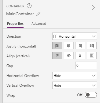
Direction: Give you the possibility to switch from Horizontal to Vertical containers and vice versa.
Justify and Align: Define how your child containers are going to be aligned with the main container (vertical and horizontal).
Gap: Space in between elements inside your container.
Example: I have added a border color to show you

Horizontal and Vertical overflow: If set to hide, it will hide the content if it goes outside horizontally or vertically of your container. If set to scroll, it will add a scrollbar if it goes outside horizontally or vertically of your container.
Wrap: If set to True, it will try to fill as possible as it can the space inside your container.
Now if you select a child container you are going to find first the same parameters than the parent ones + the following ones:
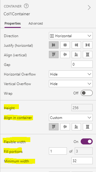
Height or Width :If you the parent is an Horizontal container you will be able to set only the Height this way and if it is a Vertical container, you will be able to set the width this way. But I really mean this way, see “Flexible width or height” and “Fill portions” parameter.
Align in container: How your elements are going to be aligned inside the container. If “set by container”, it will take the parent container property, if “custom” you can define the elements are going to be align in this container.
Flexible Width or Height: If set to false, you will have to define a Width or an Height manually. But, your width or height won’t have an impact on other columns. If set to true, you will be able to play with “Fill portions” and “Minimum width”.
Fill portions: It will define how large (or long if parent is vertical) is m container. In the screenshot, my container is taking 1/3 (a third) of the screen. But I can make it bigger or smaller than the oters.
Example:

Minimum width or height: If you have followed all the steps before, and set fill portions. You now have a responsive application. Which means your width or height of your containers are going to change depending of the screen resolution. Well here you can set a minimum width or height, in case of the screen is going too small. Your container won’t be scaled below the minimum width or height parameter.
3. Tricks and tips
3.1. Simple container (not horizontal or vertical)
We have seen the vertical and horizontal container. But while doing responsive app, there is one more container that I use quite often. It is this one:
The difference with this container, it is that inside this one, you are free to move and place the elements where ever you want. It also means, you have to be careful about how you place it, and better use Parent value with X, Y, Width and Height.
Example: With red border, it is an horizontal container. With blue border it is a container.
3.2. Usefull variables to use
The most useful ones, to be honest I am using only these ones.
Parent.Width and Parent.Height, get the width and the height of the parent element.
Also you can use App.Width and App.Height Will return the width and the height of the application. So basically of the window.
Be careful: App.DesignWidth and App.DesignHeight. These are the width and the height defined when your application is not responsive (Scall to fit set to true).
3.3. Use formula to center others elements
You might not use container all the time, and even inside the container sometime you need it. But here is the formula well know by developers to center an element inside a parent.
- Center Horizontally, set X to (Parent.Width – Self.Width) / 2
- Center Vertically, set Y to (Parent.Height – Self.Height) / 2
4. Forms issue
Unfortunately (and sorry for SharePoint Forms). Containers doesn’t workwell with Forms. Forms can be in Container, but inside forms, you can’t have containers and can’t manage your Datacard with it.
5. Video : MWCP 2022 conference (video in French)
Also, please find below my session at the conference MWCP 2022 regarding this subject. Video is in French.
Start at 10 minutes